Components for the template bank
Rated out of 25 for this job — the 24 record families in siso-shell — not for the operator dashboard. A record page's job is to show what is true, with receipts, and never to decorate, so the axes are: need (is there an unmet slot in the bank), craft, robbability (can it become static HTML on CRM tokens), truth (does it carry real state and evidence, not vibes) and dark (survives a dense dark page). Landing, marketing, shaders, loaders and toys are penalised to zero.
Source: 1290 scorable components from the SISO design system hub (SISO_Knowledge/design-system, installed source), joined to the preview mirror for images. Showing the top 216. Green blocks are your own words from picks.jsonl; grey lines are the earlier scout rubric's score. Click any card to open its folder path.
table — 22 hand-rolled in the bank
36The bank hand-rolls <table class="tbl"> in 22 places. Every record family ends up showing rows of status × when × receipt. This is the single biggest unbuilt part.
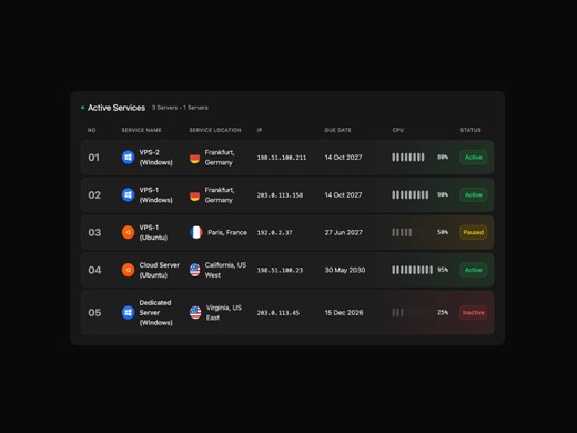
A server management table component for displaying infrastructure data including server names, OS types (Windows/Linux/Ubuntu), geographic locations, IP addresses, CPU utilization metrics, and status indicators. Features
framer-motion lucide-react next-themes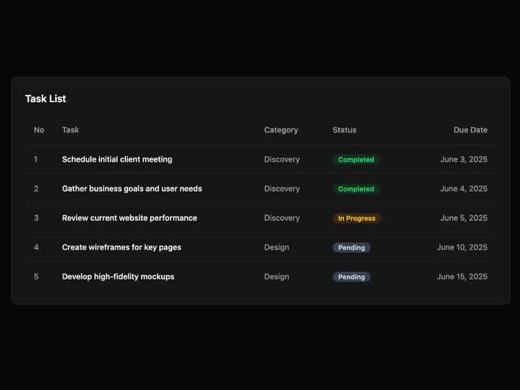
A clean, tabular task list component that displays tasks with their category, status (Completed, In Progress, Pending), and due date in an organized table format. Features animated entrance with Framer Motion stagger eff
framer-motion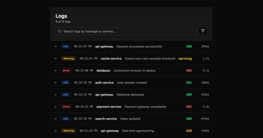
An interactive logs table component built with shadcn-ui that displays timestamped system events with filtering capabilities. Features multi-select dropdown filters for log level, service, and status, along with search f
framer-motion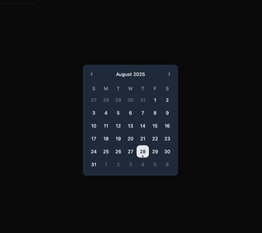
A minimalist date picker component built with @ark-ui/react featuring inline calendar display with month navigation controls, day selection grid, and dark mode support. Uses Tailwind CSS for styling with smooth hover tra
@ark-ui/react lucide-react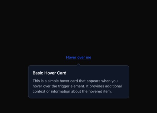
A clean hover card component built with Ark UI that reveals contextual content on mouse hover with smooth fade animations. Features a minimalist design with border styling, shadow, and dark mode support. The card include
@ark-ui/react
A lightweight badge component with four variants (default, secondary, destructive, outline) for displaying status indicators, tags, and metadata in UI applications. Built with class-variance-authority for type-safe varia
@radix-ui/react-slot class-variance-authority framer-motion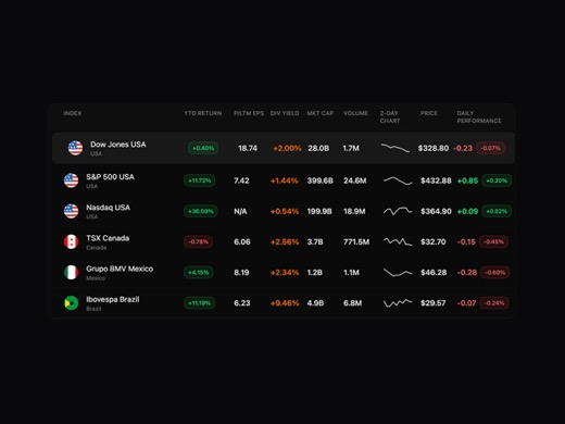
A financial markets data table component that displays stock market indices with mini sparkline charts, real-time prices, daily changes, and key financial metrics including YTD returns, dividend yields, and market capita
framer-motion next-themes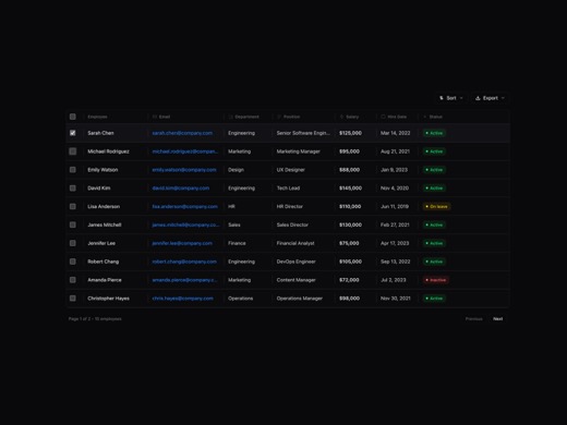
A professional resizable data table component for displaying employee records with customizable column widths, status indicators, and theme support. Features drag-to-resize columns using react-resizable, smooth animation
framer-motion lucide-react next-themes react-resizable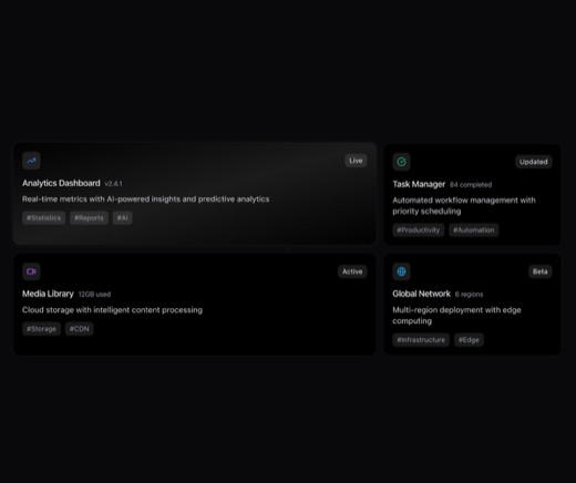
A customizable Bento Grid layout component for React that arranges content cards in a responsive masonry-style grid. Supports variable column spans, icons, status badges, tags, and hover effects. Built with Tailwind CSS
lucide-react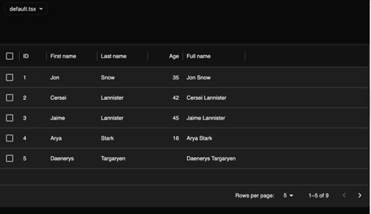
A MUI X DataGrid-based table component with sorting, pagination, and dark mode support. Features a Paper wrapper with shadow and rounded corners, displaying columns for ID, names, and age with a computed full name field.
@mui/material @mui/x-data-grid
A flexible toggle button group component from Intentui that allows users to select one or multiple options from a connected set of buttons. Supports horizontal and vertical orientations, multiple sizes, and different vis
react-aria-components tailwind-variants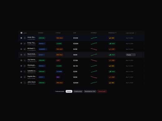
A comprehensive sales leads data table component for CRM dashboards that displays customer information including contact details, source attribution, deal values, and engagement metrics. Features animated sparkline chart
framer-motion lucide-react next-themes
A skeuomorphic navigation component featuring list and grid icon toggles designed for dark-themed interfaces. The component implements realistic, tactile button styling with hover and click interactions, making it ideal
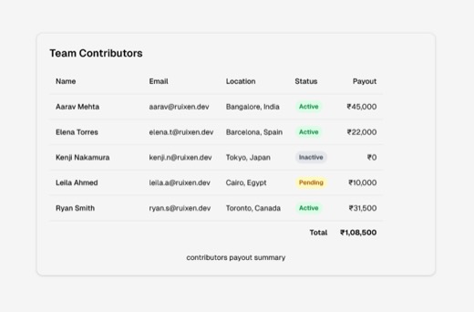
A clean, minimalist data table component for displaying contributor information including names, emails, locations, activity status, and payout amounts. Features hover interactions on rows and status-based styling with c
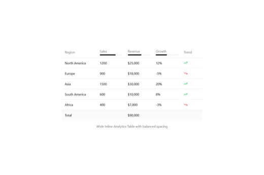
An inline analytics table component for displaying regional business metrics including sales, revenue, and growth data with trend indicators. Features progress bars for each metric column and color-coded trend icons (gre
@radix-ui/react-progress lucide-react
A lightweight badge component from the shadcn/ui design system that displays small status indicators or labels. Supports multiple variants (default, secondary, destructive, outline) for different visual treatments. Built
@radix-ui/react-dropdown-menu @radix-ui/react-slot class-variance-authority lucide-react
A flexible checkbox group wrapper component that provides consistent labeling, error handling, and layout options for grouping related checkbox inputs. Supports both horizontal and vertical arrangements with optional hel
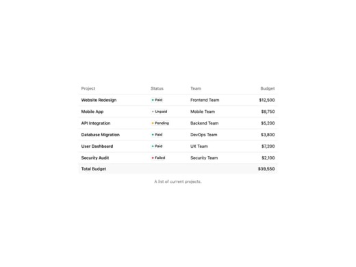
A reusable table component system from Coss.com featuring semantic HTML table elements (table, thead, tbody) with responsive overflow handling. The component includes sophisticated Tailwind styling with rounded corners,
@base-ui/react
A custom animated select dropdown component with smooth AnimatePresence transitions and click-outside-to-close functionality. Built with motion/react for fluid animations, it clones child elements to inject selection han
@phosphor-icons/react motion
Intent UI Toggle Group is a flexible, accessible form component for selecting one or more options from a grouped set of toggle buttons. Built on React Aria Components with Tailwind Variants, it supports horizontal and ve
react-aria-components tailwind-variants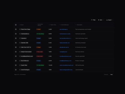
A sophisticated contacts table component with modal detail view, featuring connection strength visualization, sorting capabilities, and smooth Framer Motion animations. Supports dark/light theme modes and includes export
framer-motion lucide-react next-themes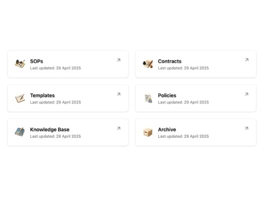
A responsive grid component that displays resource cards with icons, titles, and external links. Features staggered entrance animations via Framer Motion and subtle hover scale effects. Uses shadcn/ui design tokens for t
framer-motion lucide-react
A draggable list component that enables users to reorder items through intuitive drag-and-drop interactions with smooth Framer Motion animations. Built with React hooks for state management, supporting custom item render
clsx motion tailwind-merge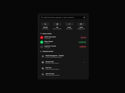
A comprehensive financial dashboard component featuring search functionality, quick actions grid, recent activity timeline, and financial services showcase. Built with Framer Motion for staggered entrance animations and
clsx framer-motion lucide-react tailwind-merge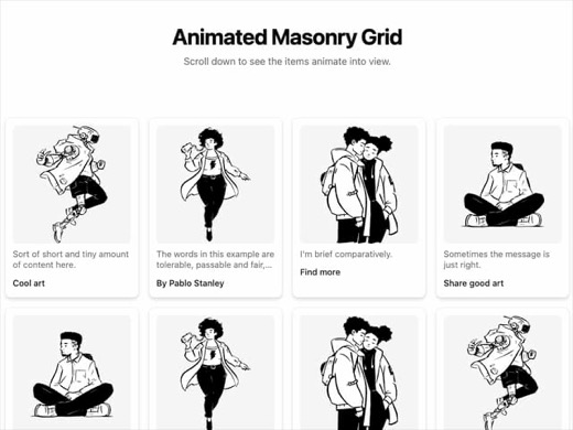
A responsive masonry grid component with scroll-triggered animations featuring scale and rotation effects. Cards animate in from different transform origins based on their column position, creating a cascading reveal eff
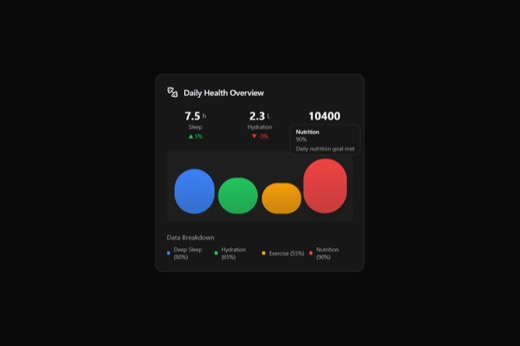
A composite data-display card component designed for presenting health statistics and metrics with optional animated bar graphs. Features a structured layout with header, stat grid, visualization area, and tooltip-enable
@radix-ui/react-tooltip framer-motion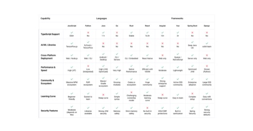
A feature comparison table component that displays supported technologies (programming languages and frameworks) with checkmark and X icons indicating support status and version information. Uses a clean tabular layout w
lucide-react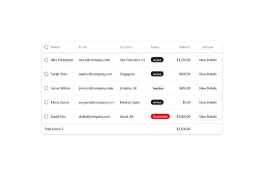
A data table component with integrated dialog functionality for viewing and managing structured data. Includes a reusable Badge component with multiple style variants (default, secondary, destructive, outline) for displa
@radix-ui/react-checkbox @radix-ui/react-dialog @radix-ui/react-icons @radix-ui/react-slot class-variance-authority lucide-react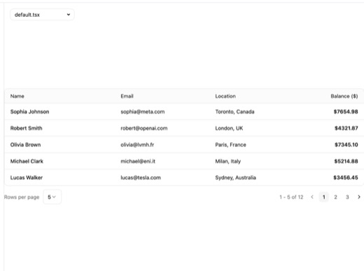
A lightweight avatar component system built on Radix UI primitives featuring profile image display with graceful fallbacks, status indicators with multiple variants (online/offline/busy/away), and flexible composition th
@dnd-kit/core @dnd-kit/modifiers @dnd-kit/sortable @dnd-kit/utilities @radix-ui/react-avatar @radix-ui/react-checkbox @radix-ui/react-dialog @radix-ui/react-dropdown-menu @radix-ui/react-popover @radix-ui/react-scroll-area @radix-ui/react-select @radix-ui/react-separator @radix-ui/react-slot @tanstack/react-table class-variance-authority cmdk lucide-react radix-ui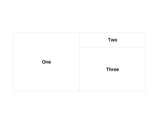
A composite resizable panel layout system built on react-resizable-panels that provides flexible split-view functionality. Features horizontal and vertical panel groups with draggable resize handles, optional grip indica
lucide-react react-resizable-panels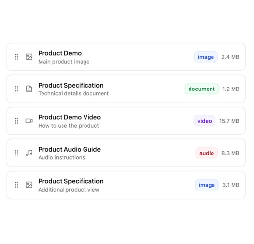
A composite Avatar component system built on Radix UI primitives featuring profile image display with automatic fallback to initials, status indicators for online presence (online, offline, busy, away), and positioning-a
@dnd-kit/core @dnd-kit/sortable @dnd-kit/utilities @radix-ui/react-slot class-variance-authority lucide-react radix-ui
A clean, accessible Avatar component built on Radix UI primitives with separate AvatarImage and AvatarFallback sub-components. Uses Tailwind for minimalist rounded styling with responsive sizing, suitable for displaying
@radix-ui/react-avatar @radix-ui/react-slot @radix-ui/react-tooltip class-variance-authority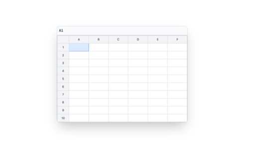
A functional spreadsheet grid component with cell selection, editing, and formula support. Features click-to-select and double-click-to-edit interactions for cells arranged in a configurable row/column layout. Implements

A React component that transforms text input into a GitHub-style contribution graph visualization. It maps characters to grid cell patterns using a letter-to-position encoding system, rendering them as green cells across
A Radix UI-based avatar component featuring image display with automatic fallback support for missing or failed images. This minimalist atomic component uses Tailwind CSS for styling with a clean rounded-full design, mak
@radix-ui/react-avatar class-variance-authority framer-motion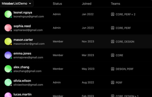
A member list component that displays users with avatars, names, roles, and priority indicators in a clean, accessible table or list format. Uses Radix UI primitives for avatars and tooltips, with Tailwind CSS for stylin
@radix-ui/react-avatar @radix-ui/react-tooltip clsx date-fns lucide-react tailwind-mergetimeline / activity
13U21 is entirely a timeline; U10, U17, U15 and U4 each carry an activity strip. The current one is a hand-drawn SVG axis.
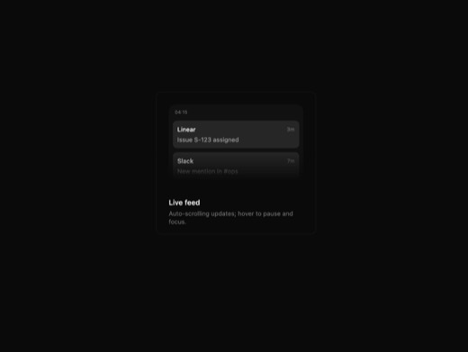
A live notification feed component featuring auto-scrolling updates that cycle every 1.6 seconds with hover-to-pause functionality. Displays timestamped feed items like payments, issues, and alerts with smooth motion ani
motion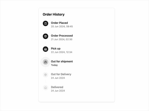
A minimalist tracking timeline component designed for displaying order history and delivery progress. Features animated entrance effects using Framer Motion with staggered transitions, status-specific icons (Check, Circl
framer-motion lucide-react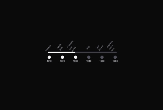
A horizontally-oriented timeline rail component that visualizes sequential steps or events with customizable dots, labels, and connecting rails. Supports both navigation links and button interactions, with emphasis styli
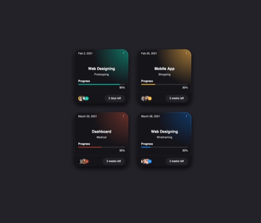
A reusable course design card component for displaying educational content progress, featuring a clean card layout with title, description, progress bar, participant avatars, and countdown timer. Built with TypeScript an
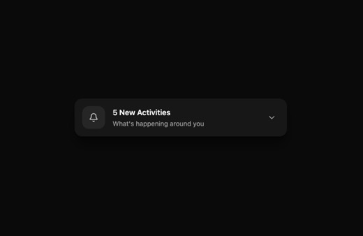
A notification and activity dropdown component featuring smooth open/close animations with rounded corner morphing transitions from rounded-2xl to rounded-3xl. Supports light and dark mode with subtle shadow effects for
lucide-react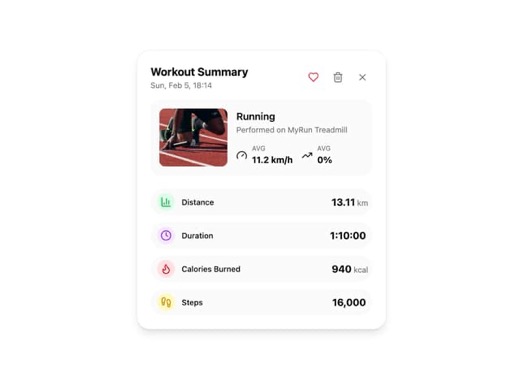
A workout summary card component for fitness tracking applications that displays workout session details including date, activity type, equipment, image, and performance metrics. Features customizable stat items with ico
framer-motion lucide-react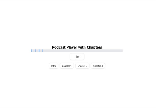
Audio player component with interactive timeline visualization and chapter markers. Features play/pause controls, progress bar, and clickable chapter segments that allow users to jump to specific timestamps. Built with T
@radix-ui/react-slot class-variance-authority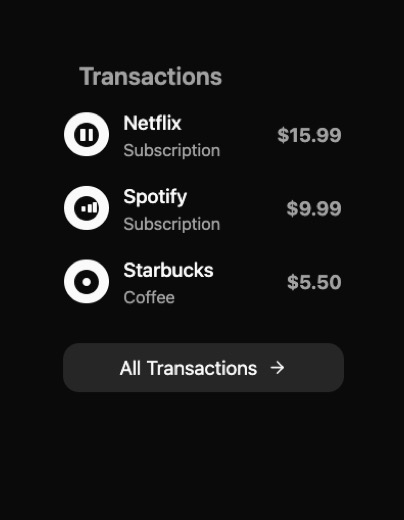
A transaction list component that displays financial transactions in a clean, animated card format. Features smooth layout transitions and click-to-expand functionality to reveal detailed transaction information includin
framer-motion lucide-react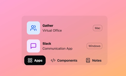
A dynamic expandable action bar component that uses Framer Motion for smooth spring-based morphing animations. The bar reveals content inline when hovering over action items, featuring glass-morphism styling with backdro
framer-motion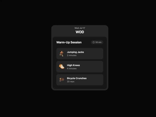
A fitness-focused card component that displays workout sessions with date, title, duration, and animated exercise lists. Built with Framer Motion for staggered list animations, it uses a clean minimalist design with roun
framer-motion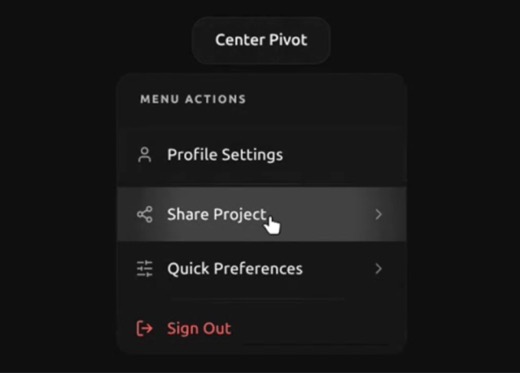
A sophisticated dropdown menu component built on Radix UI primitives featuring drill-down navigation with back history, dual-physics ripple animations, and smooth menu transitions. Supports hierarchical nested menus with
@radix-ui/react-dropdown-menu lucide-react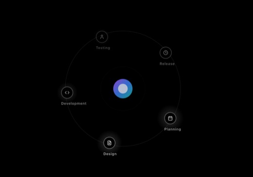
An interactive radial orbital timeline component that displays chronological events or milestones in a circular, space-themed layout with orbital animation effects. Features hover interactions and potentially scroll-trig
@radix-ui/react-slot class-variance-authority lucide-react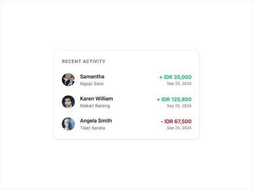
A shadcn-style activity list component featuring Framer Motion animations for staggered list item reveals. Displays activity items with avatars, names, descriptions, formatted currency amounts, and dates. Uses spring-bas
framer-motionstatus chips + state
33Every page states whether something is verified, partial, stale or blocked. The chip atom is plain; these carry richer state language.
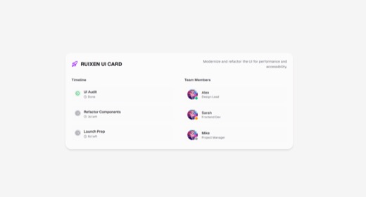
A glass-morphism styled project pulse tracker card component displaying project metadata, team member status (online/busy/offline), and milestone progress. Features a two-column responsive layout with backdrop blur effec
lucide-react next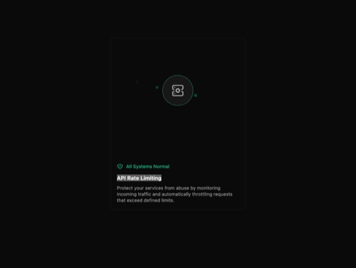
An API rate limiting monitoring card component with animated server visualization that displays throttled and allowed request statuses. Features a dark minimalist design with continuous dot animation around a central ser
framer-motion react-icons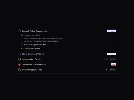
Animated hierarchical task management component featuring nested subtasks with real-time status updates, priority indicators, and tool integrations for AI agent workflows. Uses Framer Motion LayoutGroup for smooth morph
framer-motion lucide-react
A compact status indicator badge with HUD-style glass-morphism design featuring gradient fills, glowing stroke effects, and theme-aware coloring. Supports multiple variants (primary, secondary, danger, warning) with cust
framer-motion next-themes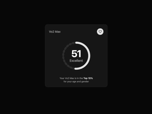
An animated metric display card featuring a radial progress bar with smooth fill animation and counting number effect. Built with Framer Motion for health/fitness data visualization, showing metrics like VO2 max with sta
framer-motion
A notification badge component that displays a count on a button with a bell icon, featuring a floating badge overlay that appears with type-specific colors and icons (success, error, info, warning). The badge auto-dismi
@radix-ui/react-slot class-variance-authority lucide-react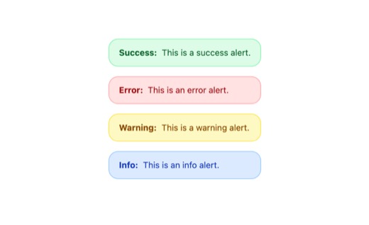
A lightweight animated alert component for displaying contextual feedback messages with color-coded types (success, error, warning, info). Features subtle entrance animations and interactive hover/tap effects using Frame
framer-motion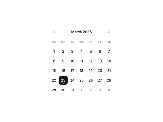
A customizable calendar date picker component built on react-day-picker, supporting single date and range selection modes. Features month/year navigation with chevron controls and dropdown selection, responsive design wi
lucide-react react-day-picker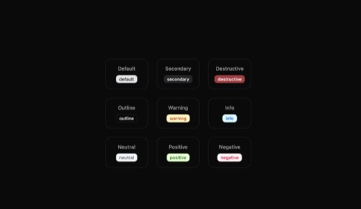
A flexible badge component with 9 semantic variants (default, secondary, destructive, outline, warning, info, neutral, positive, negative) for displaying status indicators, tags, and categorical labels. Built with CVA fo
@radix-ui/react-slot class-variance-authority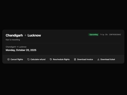
A reusable Badge component with multiple style variants (default, secondary, destructive, outline) built with class-variance-authority. Features hover and focus states for accessibility, commonly used for displaying stat
@radix-ui/react-slot class-variance-authority framer-motion lucide-react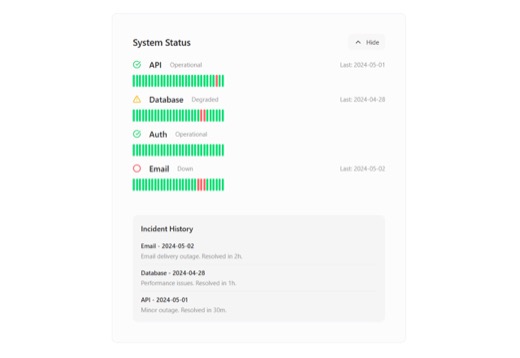
A system status block component for displaying health indicators and service states in monitoring dashboards. Provides visual feedback for system uptime, server connectivity, or API health status. Designed for integratio
@radix-ui/react-slot class-variance-authority lucide-react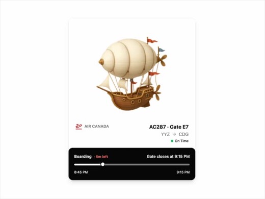
A flight status card component displaying comprehensive airline information including departure and arrival cities, flight numbers, gate details, boarding times, and real-time status indicators. Built with Tailwind CSS a
framer-motion lucide-react
A reusable badge component with four style variants (default, secondary, destructive, outline) using class-variance-authority for flexible theming. Features rounded pill styling with hover transitions and focus ring acce
@number-flow/react class-variance-authority framer-motion
A lightweight badge component using class-variance-authority for variant management. Supports four variants (default, secondary, destructive, outline) with standard hover state transitions. Built with Tailwind CSS utilit
@number-flow/react class-variance-authority framer-motion lucide-react
A reusable Badge component with four style variants (default, secondary, destructive, outline) built with class-variance-authority for consistent theming. Features hover color transitions and accessible focus rings for k
class-variance-authority motion next react-wrap-balancer
A flexible badge component with multiple color variants for displaying status labels, notification counts, and feedback states. Supports primary, secondary, destructive, success, warning, and info variants with appearanc
@base-ui-components/react class-variance-authority lucide-react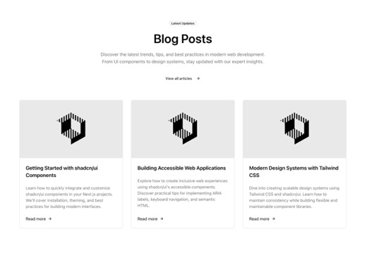
A reusable badge component with multiple style variants (default, secondary, destructive, outline) built with Tailwind and class-variance-authority. Designed for displaying short informational labels, tags, or status ind
@radix-ui/react-slot class-variance-authority lucide-react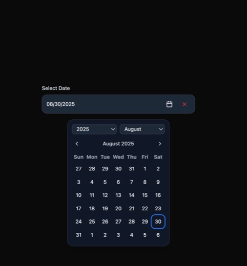
A clean, accessible date picker component built with Ark UI featuring a trigger input, month/year selectors, and a calendar grid popup. Includes dark mode support, clear functionality, and focus states. Designed for univ
@ark-ui/react lucide-react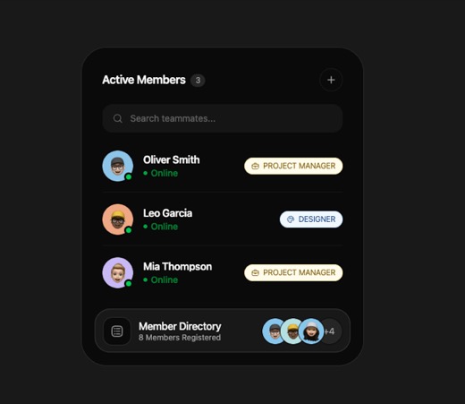
An interactive stacked list component for displaying team members with avatars, role badges, and online/offline status indicators. Features role-based filtering, search functionality, and smooth motion animations for ite
@hugeicons/core-free-icons @hugeicons/react motion
A versatile badge component with four variants (default, secondary, destructive, outline) built with Tailwind CSS and class-variance-authority. Features accessible focus states with ring styling for keyboard navigation.
@radix-ui/react-dialog @radix-ui/react-slot class-variance-authority lucide-react vaul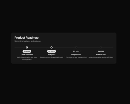
A lightweight Badge component built with class-variance-authority featuring rounded pill styling and four variants (default, secondary, destructive, outline). Ships with standard shadcn/ui patterns including focus rings
class-variance-authority framer-motion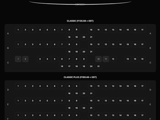
A lightweight, reusable badge component with four style variants (default, secondary, destructive, outline) following shadcn/ui design patterns. Built with class-variance-authority for consistent variant-based styling an
@radix-ui/react-slot class-variance-authority framer-motion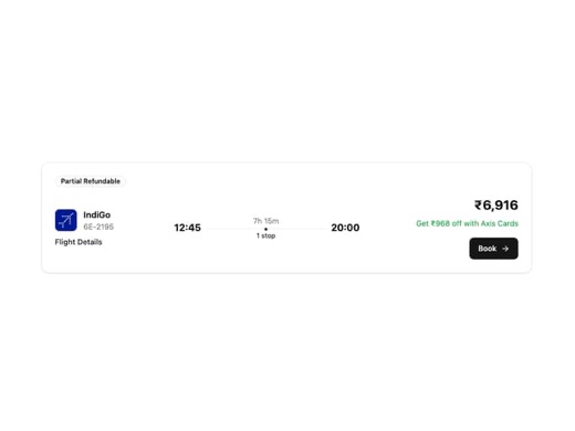
A reusable Badge component with four variants (default, secondary, destructive, outline) for displaying status labels, tags, and category indicators. Built with Tailwind CSS and class-variance-authority for flexible styl
@radix-ui/react-slot class-variance-authority framer-motion lucide-react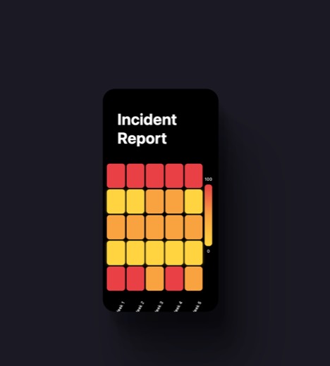
Reaviz Incident Report Heatmap is a data visualization component that displays incident data in a color-coded grid format. It maps incidents across two dimensions (likely time-based like days and hours) with red indicati
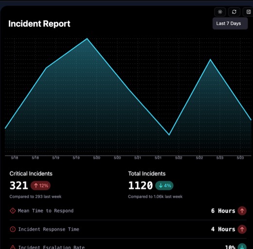
A monitoring dashboard component for displaying incident response metrics and trends. Features animated counters, area charts for visualizing incident frequency over time, and metric cards with critical/improvement statu
framer-motion reaviz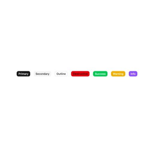
A versatile badge component with multiple visual variants (primary, secondary, success, warning, info, destructive, outline) and appearance styles (default, light, outline, ghost). Features configurable sizes, disabled s
@base-ui-components/react class-variance-authority
A composite Avatar component system featuring Radix UI primitives with multiple sub-components including Avatar, AvatarImage, AvatarFallback, AvatarIndicator, and AvatarStatus. Supports four status variants (online, offl
@radix-ui/react-hover-card class-variance-authority lucide-react radix-ui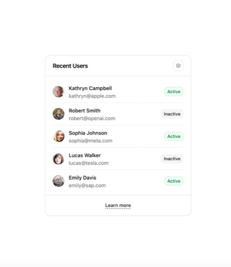
A lightweight user avatar component built on Radix UI primitives with customizable status indicators. Features composable sub-components for image, fallback, and status display. Supports online/offline/busy/away states w
class-variance-authority lucide-react radix-ui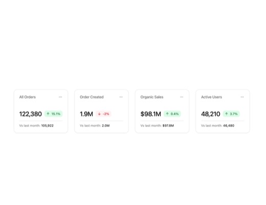
A composite Avatar component system built with Radix UI primitives and class-variance-authority. Provides five sub-components: Avatar, AvatarImage, AvatarFallback, AvatarIndicator, and AvatarStatus. Features multiple sta
class-variance-authority lucide-react radix-ui
A reusable avatar component system built with Radix UI primitives and class-variance-authority. Features multiple sub-components (Avatar, AvatarImage, AvatarFallback, AvatarIndicator, AvatarStatus) with status variants i
class-variance-authority lucide-react radix-ui
A shadcn/ui-style statistics card component featuring Radix UI Avatar primitives with status indicators (online/offline/busy/away). Uses class-variance-authority for variant management and follows clean, minimalist desig
class-variance-authority lucide-react radix-ui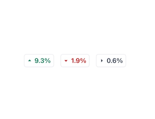
A badge component for displaying directional metric changes with up/down/neutral arrow indicators. Supports multiple variants (outline, solid, solid-outline, complex) with color-coded states for increase (emerald), decre
@remixicon/react class-variance-authority
A flexible badge component built with class-variance-authority that supports multiple variants (default, secondary, destructive, outline) for displaying status labels, tags, and counts. Features rounded pill styling with
@radix-ui/react-separator @radix-ui/react-slot class-variance-authority lucide-reactdiff / comparison
34U19 compares two arms. U12 compares recorded locators against today. U16 compares before and after a decision. Nothing in the bank does this yet.

A status cycle button component that allows users to toggle through different states or statuses with a single click. Built on Radix UI primitives with class-variance-authority for variant management, it provides multipl
@radix-ui/react-slot class-variance-authority framer-motion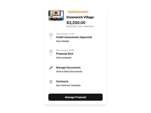
A minimalist proposal tracker card component with status badges and visual indicators. Built with shadcn/ui styling patterns, this component displays proposal progress and status information in a clean card layout. The B
@radix-ui/react-slot class-variance-authority framer-motion lucide-react next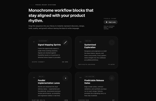
A monochrome bento-grid layout component designed to showcase service delivery workflows and methodologies. Displays five process phases (Discovery, Design, Build, Validation, Evolution) as styled cards with titles, desc
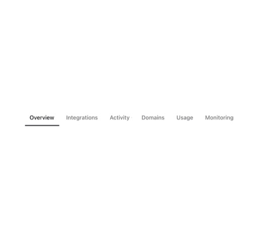
A tab navigation component featuring a smooth sliding indicator that tracks both active and hovered tab states. Styled with Vercel's minimalist aesthetic, it uses CSS transitions and dynamic positioning calculations to c
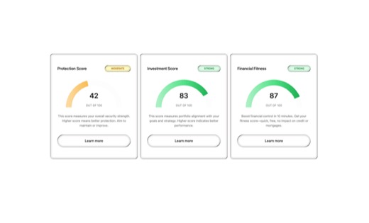
A financial score card component system designed to display key metrics, scores, and performance indicators in a clean, dashboard-friendly format. Features metric cards with visual hierarchy, status indicators via badge
@radix-ui/react-slot class-variance-authority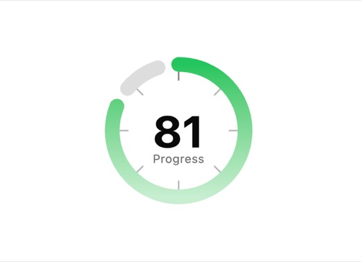
A configurable circular gauge component for displaying metrics and percentages with smooth spring animations via Framer Motion. Supports multiple rings, threshold-based coloring, gradient fills, glow effects, and various
framer-motion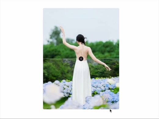
A vertical image comparison slider component that displays two images stacked vertically and allows users to drag a handle to reveal and compare them. Supports both mouse and touch-based drag interactions with state mana
lucide-react
A reusable Badge component with variant support for different visual states (default, secondary, destructive, outline). Built with class-variance-authority for flexible theming and includes hover color transitions and fo
@number-flow/react class-variance-authority lucide-react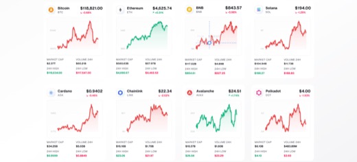
A cryptocurrency dashboard component that displays live prices, market capitalization, and percentage changes for top cryptocurrencies including Bitcoin, Ethereum, and BNB. Features animated sparkline charts for 7-day pr
framer-motion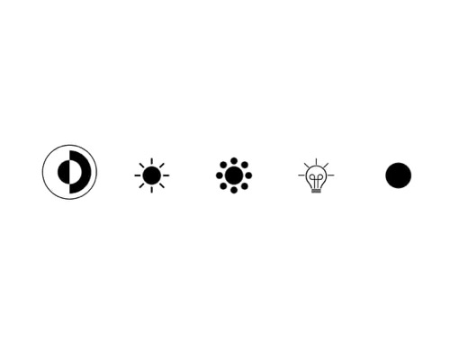
A collection of five theme toggle button variants from the Reuno UI library designed for switching between light and dark modes. Built with Framer Motion for smooth layout animations including scale, gap, and direction t
framer-motion lucide-react
A flexible button component built with Radix UI and class-variance-authority, featuring 10+ style variants including primary, mono, destructive, outline, dashed, ghost, and dim. Supports multiple sizes, optional arrow in
@radix-ui/react-slot class-variance-authority lucide-react
A flexible alert and notification component from the sean0205/rating package with multiple variant types (secondary, primary, destructive, success, info, warning, mono), appearance styles (solid, outline, light, stroke),
@radix-ui/react-slot class-variance-authority lucide-react next-themes radix-ui sonner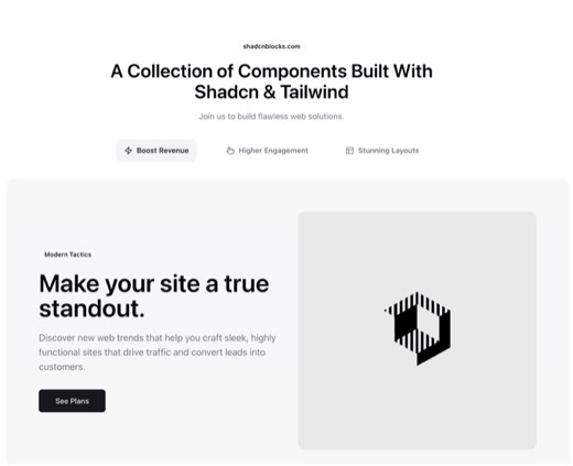
A versatile badge component with multiple style variants including default, secondary, destructive, and outline options. Features rounded pill-shaped design with hover states and focus ring accessibility. Perfect for cre
@radix-ui/react-slot @radix-ui/react-tabs class-variance-authority lucide-react
A filterable list item component with smooth spring-based entrance animations and icon support. Features staggered animation delays based on item index, selection state management, and click-to-select behavior. Uses Huge
@hugeicons/core-free-icons @hugeicons/react clsx motion
A segmented toggle group component that allows users to select one option from a set of mutually exclusive choices. Built on Ark UI with Tailwind CSS styling, featuring dark mode support and smooth state transitions. Ide
@ark-ui/react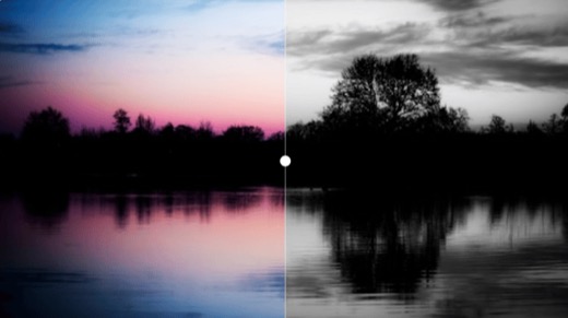
An interactive image comparison slider component with smooth spring animations for the divider handle. Supports both drag and hover-based interaction modes with full touch support for mobile devices. Uses React context f
motion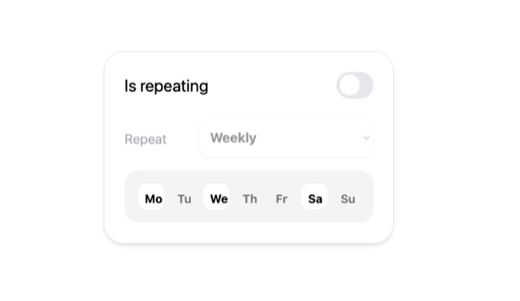
Hari Scheduler is an interactive scheduling component featuring a custom toggle switch for enabling/disabling repeating schedules with smooth color transitions. The component includes a SwapText subcomponent that animate
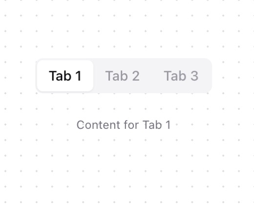
A tabbed navigation component built on Radix UI primitives, providing accessible keyboard navigation and ARIA-compliant tab switching. Features a clean, minimal design with smooth state transitions between active, hover,
@radix-ui/react-tabs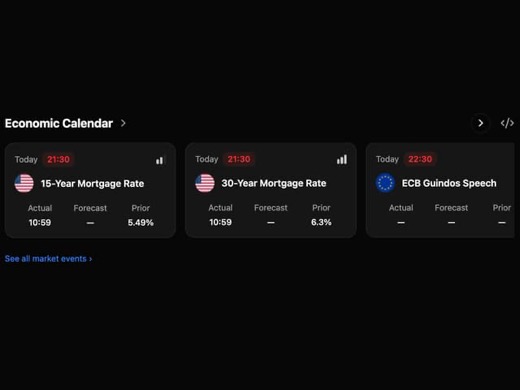
Interactive economic calendar component for displaying market-moving economic events with country codes, times, and impact levels. Features horizontal scroll navigation with directional buttons, volatility indicators sho
framer-motion lucide-react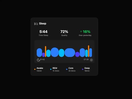
A sleep tracking card component that displays comprehensive sleep metrics including time slept, quality score, and change percentage. Features an animated bar graph visualization showing different sleep stages (Awake, RE
framer-motion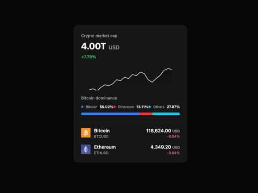
A cryptocurrency statistics card component displaying market cap data, animated sparkline charts, dominance percentages, and coin information with prices and changes. Built with Framer Motion for draw-in animations, Tail
framer-motion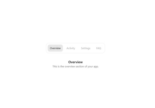
A tabbed navigation component featuring smooth fade and slide animations when switching between content panels. Built with framer-motion for fluid transitions, Radix UI primitives for accessibility, and glass-morphism st
@radix-ui/react-tabs framer-motion
A versatile pagination component with multiple button variant styles including primary, outline, ghost, and mono themes. Built on Radix UI primitives with Tailwind CSS, it provides accessible page navigation with proper
class-variance-authority lucide-react radix-ui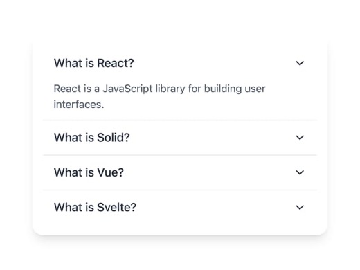
A clean accordion component built with @ark-ui/react and animated with framer-motion, featuring smooth expand/collapse transitions with a rotating chevron indicator. The component uses AnimatePresence and motion for heig
@ark-ui/react framer-motion lucide-react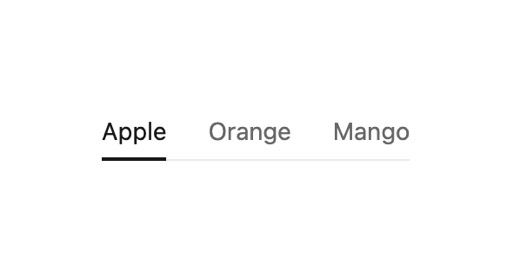
A navigation tabs component with primary (underline style) and secondary (pill style) variants. Supports disabled states, optional icons, and integrates with a tooltip component. Features minimalist flat design with hove
clsx react-tooltip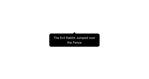
A lightweight tooltip wrapper component built on react-tooltip with customizable positioning, alignment, and color types. Uses Tailwind CSS for styling with semantic color variants and configurable appearance delays. Des
react-tooltip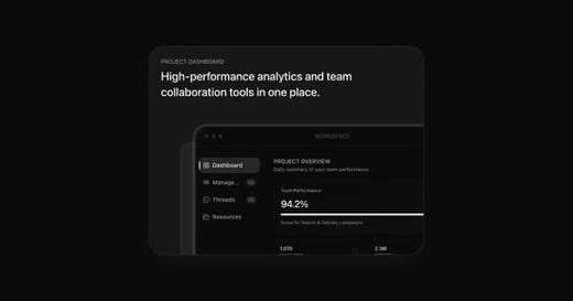
A bento-style dashboard card featuring animated tab navigation between four content panels: Dashboard, Management, Threads, and Resources. Built with Framer Motion for smooth transitions using LayoutGroup and AnimatePres
@hugeicons/core-free-icons @hugeicons/react motion
A discover button component combining tabbed navigation with an expandable search input. Features animated search expansion using Framer Motion's spring physics, dual-state tabs for Popular/Favorites filtering, and integ
@hugeicons/core-free-icons @hugeicons/react motion
Animated tab navigation component with discrete styling, featuring smooth transitions between content sections using framer-motion. The component supports multiple tab states and provides visual feedback through motion e
motion
A foundational button component with Radix UI Slot integration and class-variance-authority for flexible styling. Supports 6 visual variants (default, destructive, outline, secondary, ghost, link) and 4 sizes (default, s
@radix-ui/react-slot class-variance-authority
A modal dialog component built with Radix UI primitives and styled with Tailwind CSS. Features configurable button variants using CVA for different styles and states. Includes Lucide icons for close and confirm actions,
@radix-ui/react-dialog @radix-ui/react-slot class-variance-authority clsx lucide-react tailwind-merge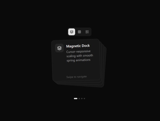
A morphing card stack component featuring smooth layout transitions between stack, grid, and list views, with drag/swipe navigation and expandable card details. Built with Framer Motion for fluid animations and supports
framer-motion lucide-react
A reusable Button component built with Radix UI Slot for composition and class-variance-authority for variant management. Supports 6 visual variants (default, destructive, outline, secondary, ghost, link) and 4 sizes (de
@radix-ui/react-slot class-variance-authority lucide-react next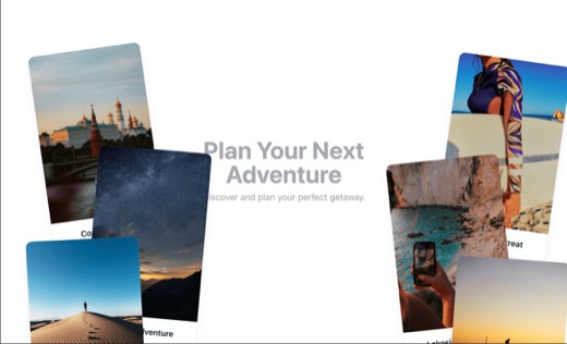
A draggable card component featuring travel destination images with titles. Cards support mouse and touch drag interactions, z-index management for layering, and bring-to-front functionality when dragged. Designed for in
progress with verification lines
21"What landed / what is left" appears on U4, U9, U3, U17 — each item with a verification line. Currently a flat list.
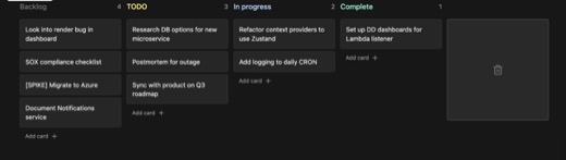
A dark-themed Kanban board component with drag-and-drop functionality for organizing tasks across customizable columns (Backlog, TODO, In Progress, Complete). Built with Framer Motion for smooth animations and includes a
framer-motion lucide-react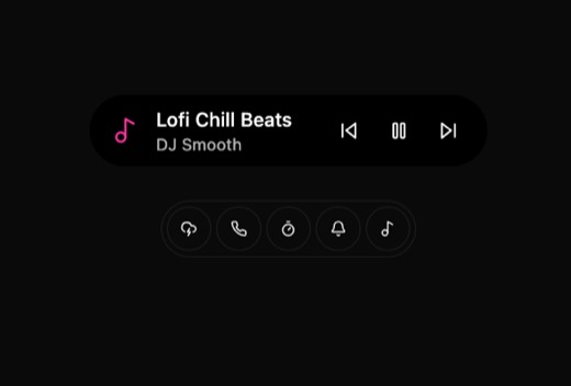
A dynamic island-inspired notification overlay component that morphs between compact and expanded states. Features animated transitions between idle, timer, and activity states with weather info, music controls, and phon
lucide-react motion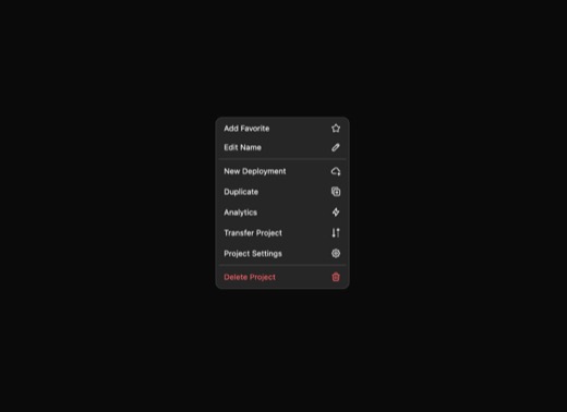
An inline dropdown component featuring click-to-reveal options with hover states and hold-to-confirm progress animation. Supports multiple interactive states including favorite toggling, inline editing, and context actio
clsx framer-motion react-icons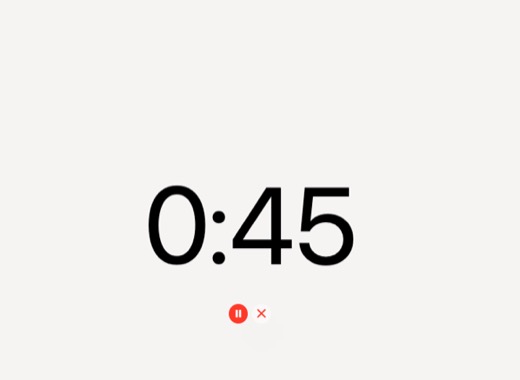
An animated number display component that renders smooth, flowing number transitions using the NumberFlow library and framer-motion. Features countdown timer functionality with pause and reset controls, minimal styling w
@number-flow/react framer-motion lucide-react react-intersection-observer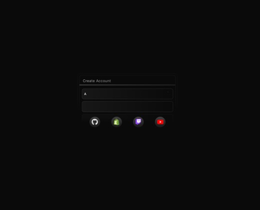
An animated login form component featuring staggered text animations, social authentication icons (GitHub, Shopify, Twitch, YouTube), circular progress indicators, and dark mode support. Uses Framer Motion for smooth ent
motion react-icons
A swipe-to-verify button component that requires users to drag a thumb or indicator across a track to confirm an action. The component features drag-based interaction with visual feedback states including idle, swiping,
lucide-react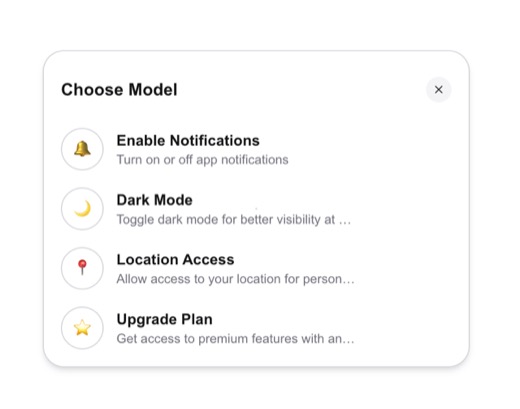
A dropdown select component with smooth Framer Motion animations, featuring a pill-shaped trigger that morphs into an expanded dropdown menu with spring-based transitions. Built with Tailwind CSS and lucide-react icons,
framer-motion lucide-react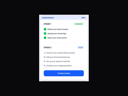
A customizable onboarding progress stepper component that displays sequential stages with completion status, progress percentage, and themed color options. Built with Framer Motion for staggered entrance animations, it s
framer-motion lucide-react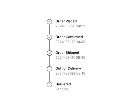
A vertical step-by-step order tracking component that displays order progress with completed and incomplete states. Features CheckCircle2 and Circle icons with connecting vertical lines that change color based on complet
lucide-react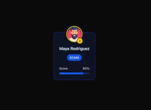
A leaderboard entry card component displaying ranked users with avatars, scores, progress bars, and optional crown icons for first place. Features configurable color tones (emerald, blue, zinc), size variants, dark mode
lucide-react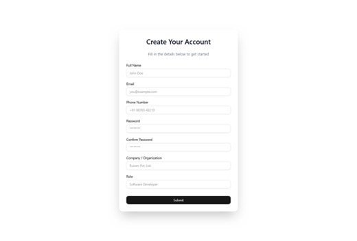
A success login card component designed to confirm successful user authentication. Features a clean, minimalist design with button variants supporting multiple visual states including default, destructive, outline, secon
@radix-ui/react-slot class-variance-authority framer-motion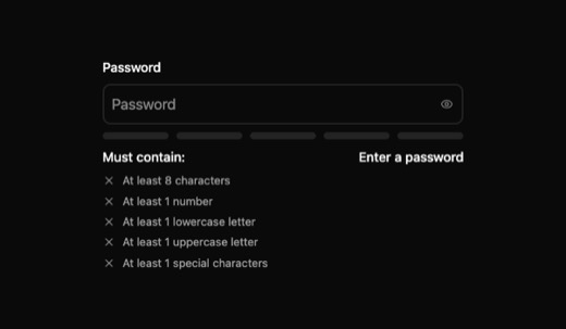
A password input component with real-time strength validation featuring a visual strength meter, animated progress bars, and a requirements checklist. The component includes a password visibility toggle with eye icons an
lucide-react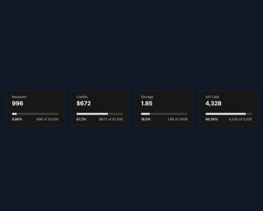
A minimalist stats card component for displaying metrics and progress indicators. Features a clean card layout with header, title, description, and progress visualization using Radix UI primitives. Designed for dashboard
@radix-ui/react-progress clsx tailwind-merge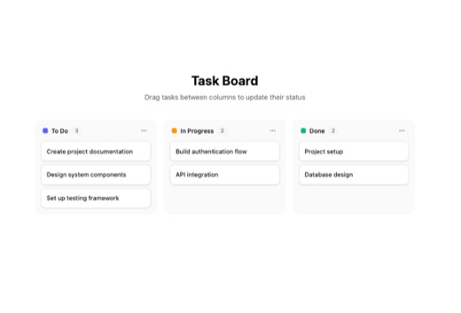
A fully functional Kanban board component with drag-and-drop task management capabilities. Supports multiple columns with customizable colors, labeled tasks with assignees, and dynamic task creation. Built for project ma
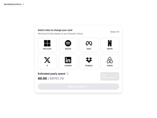
A spending migrator component that enables users to select multiple sites or services to migrate their spending, featuring an animated credit card preview, progress tracking via NumberFlow, and animated selection states.
@number-flow/react framer-motion lucide-react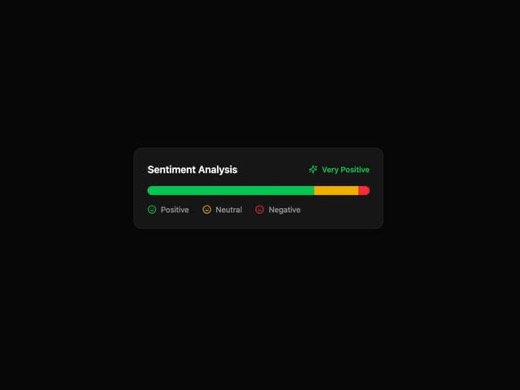
A sentiment analysis card component that displays categorized sentiment data through animated segmented progress bars. Features a clean header with overall sentiment indicator, icon support, and accessibility-friendly pr
framer-motion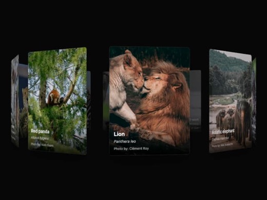
A circular gallery component that arranges items around a central point in a radial layout. The gallery responds to scroll events by rotating the items based on scroll progress, and automatically rotates when the user st
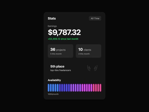
A composite card component designed to display freelancer statistics including earnings with percentage changes, sub-statistics with labels, ranking information with icons, and animated availability bars. Built with Fram
framer-motion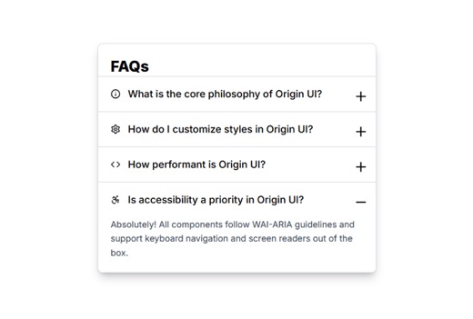
A glassmorphic FAQ accordion component with translucent backdrop blur effects and smooth expand/collapse animations. Features icon-labeled items with developer-focused content about Origin UI, including TypeScript suppor
@radix-ui/react-accordion @radix-ui/react-icons framer-motion lucide-react
A lightweight checkbox input component with hover states and support for disabled and indeterminate modes. Built with Tailwind CSS using clean, monochrome styling with subtle hover interactions. Ideal for forms, settings
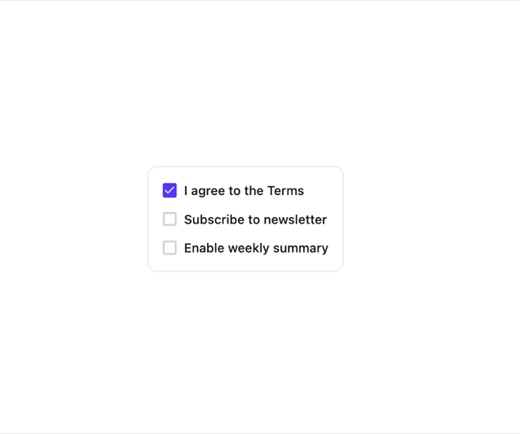
A lightweight checkbox component from Subframe library featuring proper accessibility with focus-visible outlines and keyboard navigation support. Includes hover and active states with dark mode compatibility. Designed a
@subframe/corekey-value / spec panel
14The kv atom is used everywhere (heads, versions, probes, cost). It is the plainest thing in the bank.
An animated button component with generation-focused styling, featuring smooth state transitions between idle and active/generating modes. Includes customizable hue-based highlighting, inner shadow depth effects, and SVG
clsx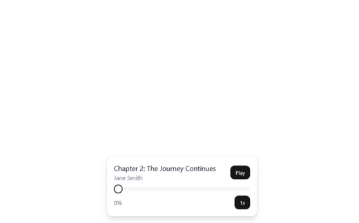
A floating audio book player component with play/pause controls, progress slider, chapter display, and adjustable playback speed. Uses the HTML5 Audio API for audio playback and features a dark-mode compatible, minimal d
@radix-ui/react-slider @radix-ui/react-slot @radix-ui/react-tooltip class-variance-authority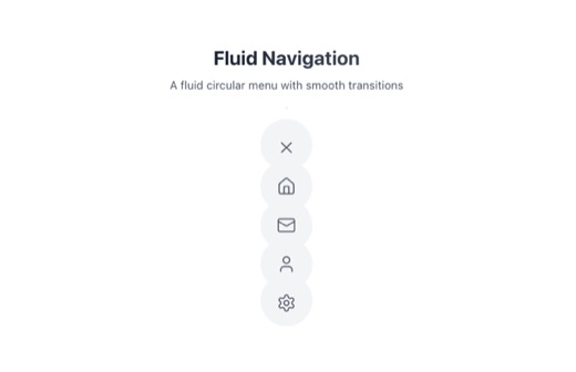
A lightweight dropdown menu component with trigger and menu item support. Features left/right alignment options, optional chevron indicator, dark mode styling, and proper ARIA accessibility attributes. The menu opens on
lucide-react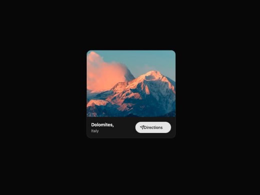
A location card component with hover animations, image display, and call-to-action for location-based content. Features smooth Framer Motion animations including scale, translate, and icon slide effects on hover. Designe
framer-motion lucide-react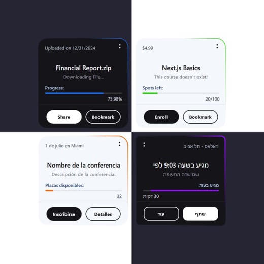
The Bauhaus Card is a dark-themed card component featuring a rotating gradient border, glass-morphism styling, and CSS variable theming for customization. It includes a header with date and action buttons, a body section
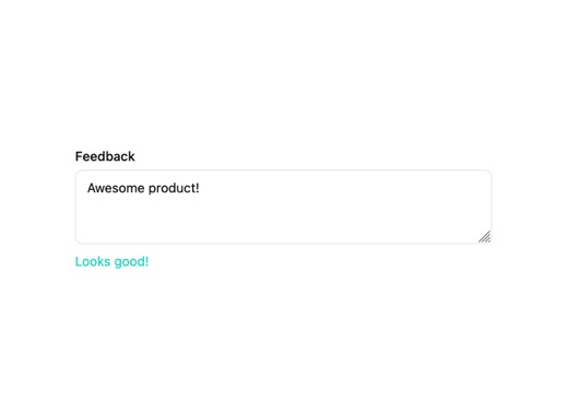
A feedback textarea component with real-time validation that displays error messages when input is below a minimum character threshold and success feedback when valid. Features accessible aria-invalid attributes and role
@radix-ui/react-label class-variance-authority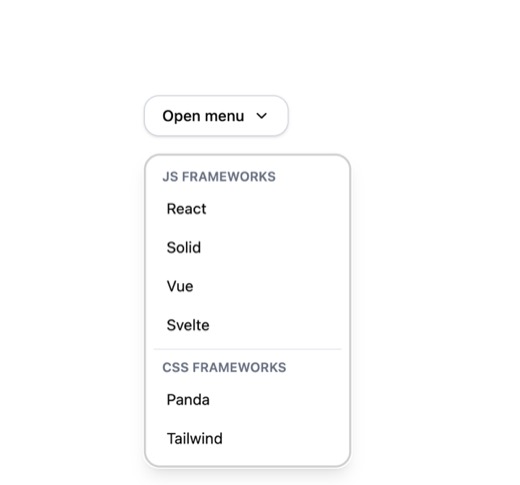
A grouped dropdown menu component built with Ark UI and Tailwind CSS featuring dark mode support, hover states on menu items, and organized content groups with dividers. This accessible, headless component provides a cle
@ark-ui/react lucide-react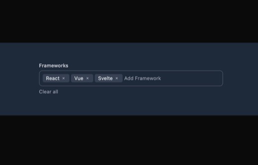
A tags input component built with Ark UI that allows users to add, display, and remove multiple tag items in a flexible input field. Features dark mode support, keyboard-accessible delete buttons, and visual focus states
@ark-ui/react lucide-react
A dual-option radio button component with dark theme styling and subtle glow effects. Features 'yes' and 'no' options represented by circle and X icons respectively, with visual feedback on selection. Designed for binary
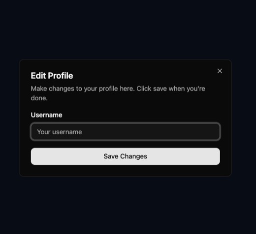
A modal dialog component built on Radix UI primitives with Tailwind CSS styling. Features multiple button variants (default, destructive, outline, secondary, ghost, link) and full dark mode support. Includes a close butt
@radix-ui/react-dialog @radix-ui/react-label @radix-ui/react-slot class-variance-authority clsx lucide-react tailwind-merge
A custom React hook that manages character limiting for text inputs and textareas. It tracks current value, character count, and provides a change handler that prevents input beyond the specified maxLength. Ideal for bui
A minimalist theme switcher component that provides a pill-shaped radio button group for selecting between system, light, and dark modes. It uses localStorage for persistence and window.matchMedia for system preference d
clsx
A lightweight theme toggle component that allows users to switch between system, light, and dark modes. Features smooth animated selection indicators using Framer Motion's layout animations, hover states, and accessibili
framer-motion lucide-react next-themes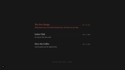
A minimalist blog card component with dark mode support and elegant hover interactions. Features a serif title font, monospace date display, and a warm terracotta accent color (#ce624c) that triggers on hover. The compon
relationship map
13The map part is done (tidy-tree from airbnb-linktypes) but alternates are worth seeing.
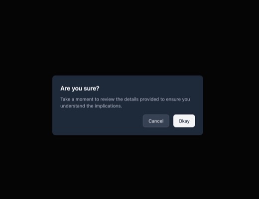
A functional alert/confirmation dialog component built with Ark UI featuring backdrop blur overlay, smooth open/close animations, dark mode support, and accessible focus management. Displays a title, descriptive message,
@ark-ui/react
An animated horizontal menu bar component featuring five navigation items (dashboard, notifications, settings, help, security) with custom SVG icons. The component uses smooth CSS transitions to animate the active indica
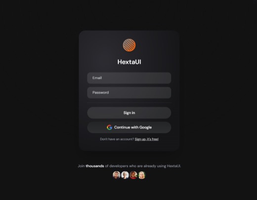
A sleek dark-themed sign-in form featuring glass-morphism styling with backdrop blur effects and gradient accents. The component includes email and password input fields with client-side validation, error messaging, and

An animated world map component that renders a dotted geographical visualization with curved animated paths connecting locations. Features theme-aware styling with dark/light mode support, hover interactions on locations
dotted-map framer-motion next next-themes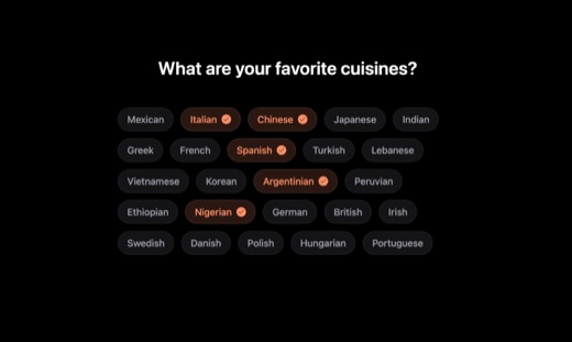
A multi-select cuisine preference selector with animated dark-themed chips built using framer-motion. Users can select multiple cuisines from a list of 24 global options with smooth layout transitions when items reflow.
framer-motion lucide-react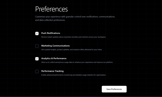
A premium dark-themed checkbox component with smooth spring animations for the checkmark reveal and subtle scale effects on hover and tap. Features a glow effect when checked and uses framer-motion for polished micro-int
framer-motion lucide-react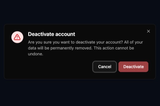
A confirmation dialog component designed for deactivation workflows, featuring a destructive action warning with AlertTriangle icon. Built with Radix UI Dialog primitives for accessibility and includes a comprehensive bu
@radix-ui/react-dialog @radix-ui/react-slot class-variance-authority clsx lucide-react tailwind-merge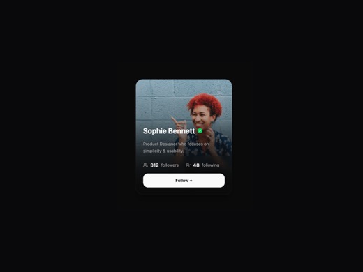
A hover-animated profile card component featuring smooth motion effects with scale, translate, and blur transitions. Displays user avatar, verification badge, bio text, follower/following statistics, and a follow action
framer-motion lucide-react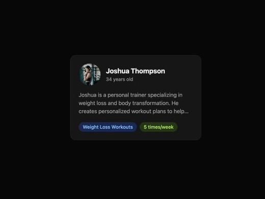
A profile card component that displays user information including avatar, name, subtitle, description, and customizable tags. Features smooth entry animations and hover scale effects using Framer Motion. Supports dark mo
class-variance-authority framer-motion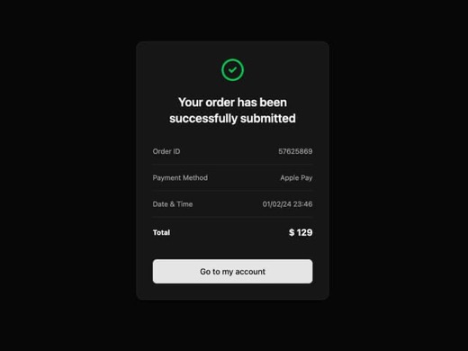
A card component designed to display order confirmation details after a successful transaction. Built with shadcn/ui patterns using Radix primitives and Tailwind CSS for styling. Features a clean, minimal aesthetic with
@radix-ui/react-slot class-variance-authority framer-motion lucide-react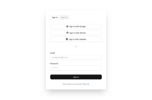
A card-wrapped authentication component featuring tabbed navigation between sign-in and sign-up modes, with integrated social login buttons for Google, GitHub, and LinkedIn, plus standard email/password form fields. Styl
@radix-ui/react-slot @radix-ui/react-tabs class-variance-authority react-icons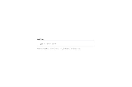
A clean, minimalist tag input component that allows users to add and remove tags via keyboard (Enter/Backspace) or click interactions. Features dark mode support, focus states with ring indicators, and hover effects on i
@radix-ui/react-label class-variance-authority lucide-react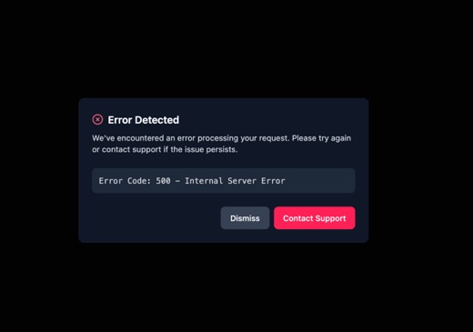
A modal overlay dialog built on Radix UI primitives featuring smooth fade and zoom animations for enter/exit transitions. The component includes a semi-transparent backdrop overlay, centered content positioning, and resp
@radix-ui/react-alert-dialog @radix-ui/react-slot class-variance-authority lucide-reactagent entry / commands
13Every family ends with a command block a cold agent runs. Now a terminal; these are the alternates.
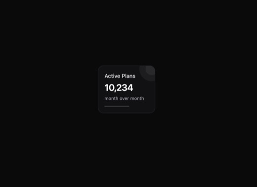
A versatile KPI card component for displaying key performance indicators with trend visualization. Supports multiple visual tones (default, primary, success, warning, danger), trend indicators (up/down/flat), and optiona
lucide-react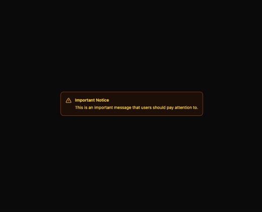
A versatile admonition component providing contextual feedback through color-coded alert boxes. Supports seven distinct notification types (note, tip, info, warning, danger, success, caution) each with semantic icons and
lucide-react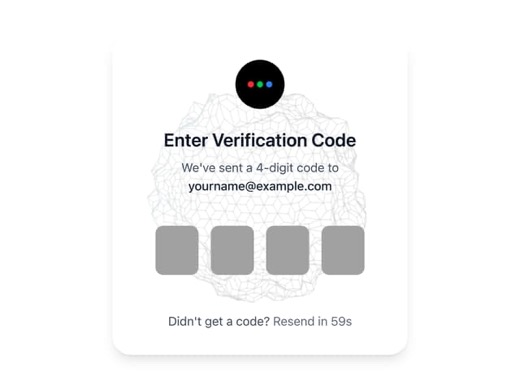
A secure OTP (One-Time Password) input component with animated success and error states. Features spring-based animations using Framer Motion for verification feedback, including a checkmark reveal on successful validati
framer-motion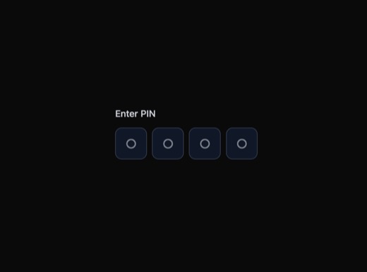
A lightweight PIN/OTP input component built on Ark UI for accessibility compliance. Features auto-value-complete functionality, dark mode support, and clean focus states with ring effects. Ideal for authentication flows
@ark-ui/react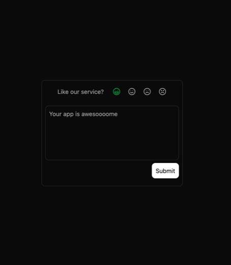
An emoji-based feedback card component that collects user satisfaction ratings through animated emoji buttons (Laugh, Smile, Frown, Angry) and an optional text area. Features smooth morphing animations between states usi
framer-motion lucide-react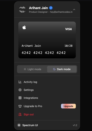
A profile dropdown component featuring a user avatar with hover scale animation, theme toggle (light/dark mode), and a menu with navigation options including activity log, settings, integrations, upgrade to Pro, and sign
framer-motion lucide-react next next-themes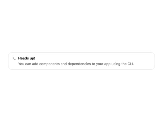
A semantic alert/notification component with five color-coded variants (default, error, info, success, warning) using CVA for variant management. Features a grid-based layout with icon support, accessible role='alert', a
class-variance-authority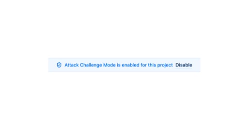
A lightweight status banner component that displays contextual messages using color-coded variants (success, warning, error). Features an optional icon, label text, and call-to-action link for user engagement. Designed w
clsx react-tooltip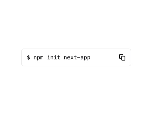
A lightweight code snippet component with copy-to-clipboard functionality. Supports multiple display variants including default, inverted, and semantic states (success, warning, error) with optional prompt styling. Featu
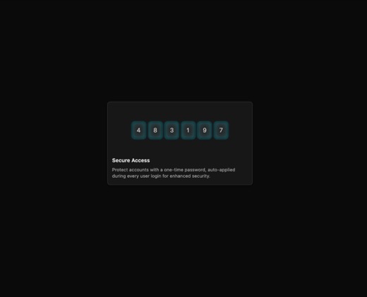
An animated OTP (One-Time Password) input component featuring staggered digit reveal animations with fade effects. The component displays a security-themed card with animated digits cycling through auto-generated codes,
motion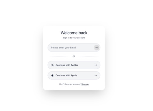
A sleek login card component with glass-morphism styling and backdrop blur effects. Features animated entrance using Framer Motion with staggered reveals, dark mode support, and responsive design. Includes email input fi
framer-motion lucide-react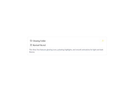
GlowTree is an animated hierarchical tree component for displaying file and folder structures with glowing visual effects. It features expand/collapse functionality, selection states, and smooth Framer Motion animations
framer-motion lucide-react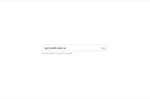
A minimalist inline copy input component that displays text with a one-click copy-to-clipboard button. Features emerald color feedback on successful copy with automatic reset, dark mode support, and rounded border stylin
searchable catalogue
7U2, U23, U9 and U1 all filter lists. The search row is the apple-spotlight pill; the results treatment is still plain.
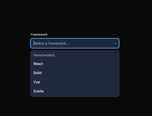
An Ark UI-based combobox component providing an accessible autocomplete dropdown with keyboard navigation, filter-based search, and clear functionality. Features a minimalist flat design with dark mode support, using a p
@ark-ui/react lucide-react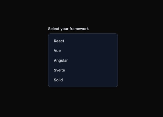
An accessible listbox component built on Ark UI that provides a dropdown selection interface with keyboard navigation support, check indicators for selected items, and dark mode compatibility. Designed for forms and sett
@ark-ui/react lucide-react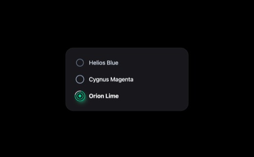
A customizable radio button group component featuring glass-morphism styling with backdrop blur, gradient glow effects, and customizable color themes. Supports keyboard navigation, dark mode, hover states with animated g
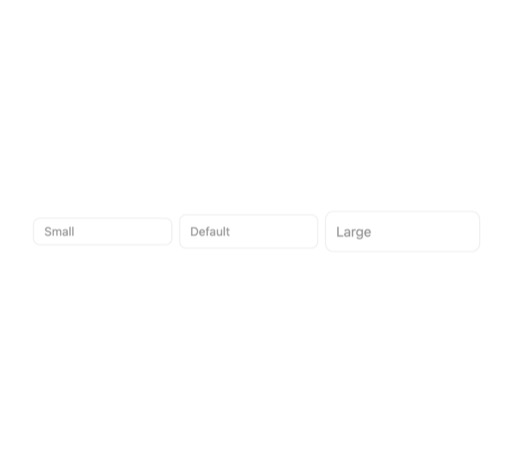
A clean, minimal text input component with integrated error state handling. Features customizable sizes (small, medium, large), error icons with optional action links, and red-themed error messaging for validation feedba
clsx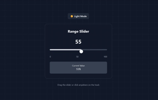
A fully interactive range slider component with drag-to-select functionality supporting both mouse and touch inputs. Features dark/light mode toggle and smooth animations via Framer Motion. Ideal for numeric value select
framer-motion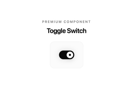
A polished toggle switch component with bouncy animations, gradient track styling, and subtle glow effects when active. Features smooth press states and hover feedback, making it ideal for premium feature gates and setti
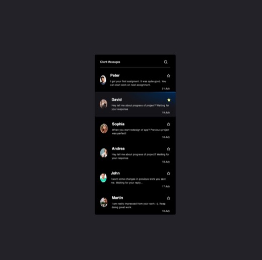
A minimalist sidebar component that renders a scrollable list of message cards, each displaying user avatar, name, message preview, and timestamp. Supports click-to-select interaction with active state highlighting and a
clsx lucide-reactreceipt on hover
9Claims need their receipt reachable without leaving the page — a hover card over a fact.
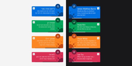
A toast notification system that displays temporary alert messages in four types: success, error, warning, and help. Features an auto-dismissing progress timer bar, Lucide icons, and an imperative API for programmatic co
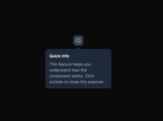
A lightweight info popover component built with Ark UI that displays contextual information in a bordered panel with title and description. Features a trigger button with focus and hover states, smooth fade animations, a
@ark-ui/react lucide-react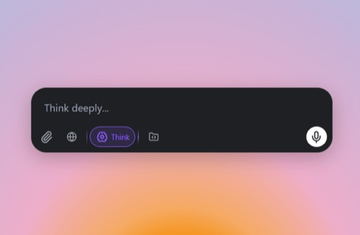
An AI prompt input box component with dark minimalist styling, featuring a resizable textarea, action tooltips for attachments, voice input, and stop generation controls. Built with Radix UI primitives, Framer Motion ani
@radix-ui/react-dialog @radix-ui/react-tooltip framer-motion lucide-react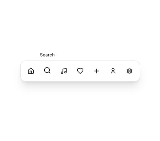
A floating dock navigation component featuring animated icon buttons with smooth hover effects, tooltip labels, and a continuous subtle floating animation. Built with Framer Motion for fluid interactions, this component
framer-motion lucide-react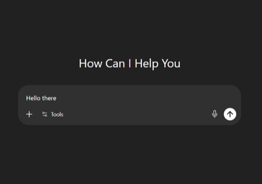
A ChatGPT-style prompt input component built with Radix UI primitives providing accessible tooltips, popovers, and dialog support. Features smooth fade and zoom animations for overlays, dark mode support, and a clean min
@radix-ui/react-dialog @radix-ui/react-popover @radix-ui/react-tooltip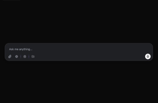
A dark-themed AI prompt input box component featuring a textarea with auto-resize, multiple action buttons for file attachments, microphone, language selection, and AI settings, all protected by tooltips. Built with Fram
@radix-ui/react-dialog @radix-ui/react-tooltip framer-motion lucide-react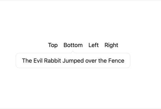
A lightweight tooltip component that displays contextual information when triggered by hover or anchor selection. Features configurable placement in four directions, dark mode support via CSS variables, and uses react-to
react-tooltip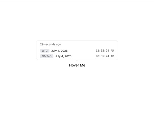
A minimalist tooltip trigger component that wraps children and displays contextual content in a styled tooltip on hover. Uses react-tooltip for functionality with customizable placement (top, bottom, left, right) and sup
react-tooltip
A contact card component featuring a full-bleed profile image with an overlay that smoothly reveals on hover, displaying contact information with slide-up animations. Supports multiple color variants (default, primary, s
lucide-react nextnested records
3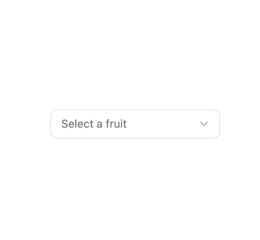
A customizable select dropdown component built on Radix UI with support for custom indicators, keyboard navigation, and visual states including focus, disabled, and error validation. Features context-based indicator posi
class-variance-authority lucide-react radix-ui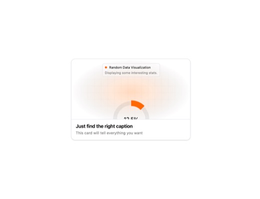
A composite animated card component featuring modular sub-components (CardBody, CardTitle, CardDescription, CardVisual) for building flexible card-based interfaces. Supports dark mode, hover animations via Tailwind group
clsx tailwind-merge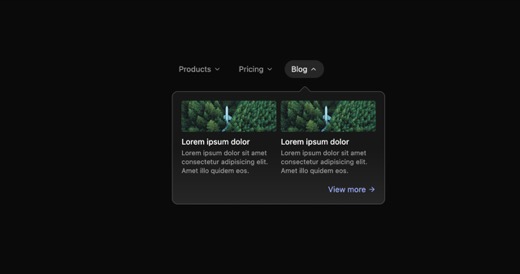
An animated shifting tab dropdown component featuring smooth directional animations based on selection order. Tabs reveal dropdown content on hover with a rotating chevron indicator and fade-in transitions. Uses framer-m
framer-motion react-iconspeople records
4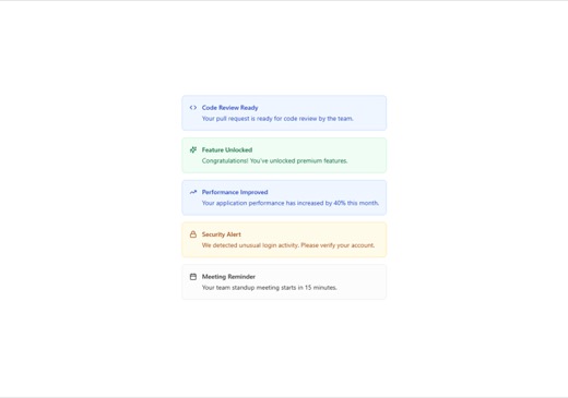
A versatile alert component with multiple semantic variants (default, destructive, warning, success, info) supporting custom icons, dismissible behavior with smooth exit animations via motion/react, and full dark mode co
class-variance-authority lucide-react motion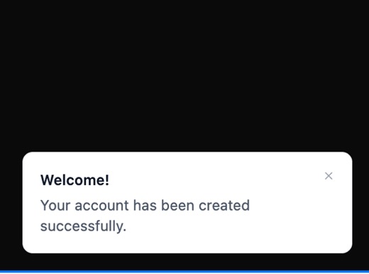
A toast notification component built with Ark UI that displays temporary messages to users. Features title and description fields, close button, smooth transitions, and dark mode support. Triggers on button click with co
@ark-ui/react lucide-react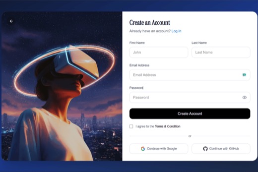
A modern split-screen sign-up page featuring a gradient dark theme with glass-morphism effects on the left panel for branding imagery, and a clean minimal form on the right for user registration with first name, last nam
lucide-react react-router-dom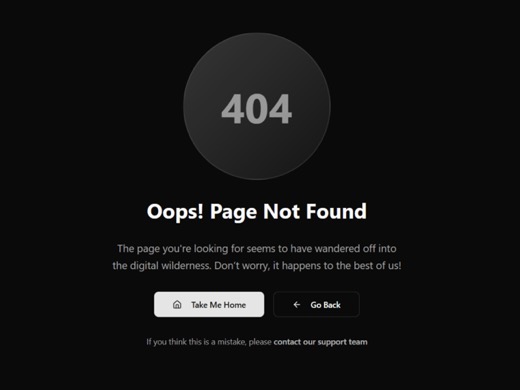
A minimalist 404 error page component with integrated navigation options including a home button and back arrow. Features a theme toggle for dark/light mode switching and includes an inlined Button component with default
lucide-reactmeasured numbers
15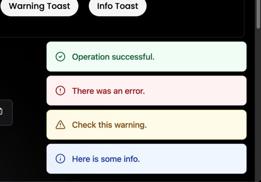
A React toast notification system with context-based architecture supporting multiple toast types (success, error, warning, info) and 5 position options. Features auto-dismiss after 5 seconds, framer-motion animations, a
framer-motion lucide-react
A 404 error page component with a dark minimalist design featuring animated message display, character animations, and circle effects. The page fades in with a 1.2-second delay and includes a styled back button with hove
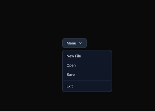
A reusable dropdown menu component built with Ark UI that provides accessible keyboard navigation and focus management. Features dark mode support, portal rendering for proper z-index positioning, and styled menu items w
@ark-ui/react lucide-react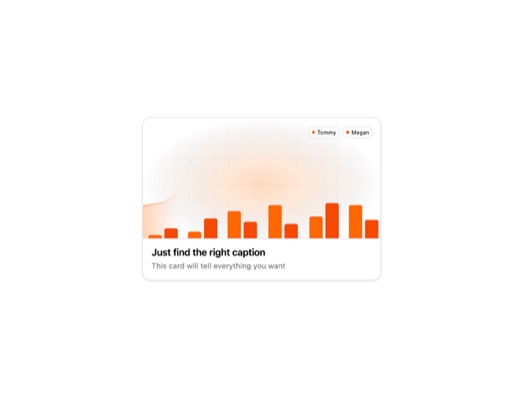
A reusable animated card component from the 21st.dev design system featuring a clean, flat visual style with dark mode support. The card includes modular sub-components for title, description, body content, and visual ar
clsx tailwind-merge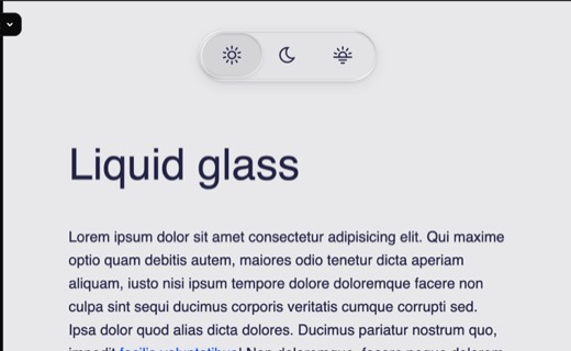
An Apple-inspired theme switcher component featuring a liquid glass aesthetic with light, dark, and dim mode options. The component uses glass-morphism styling with smooth hover and click animations to toggle between the
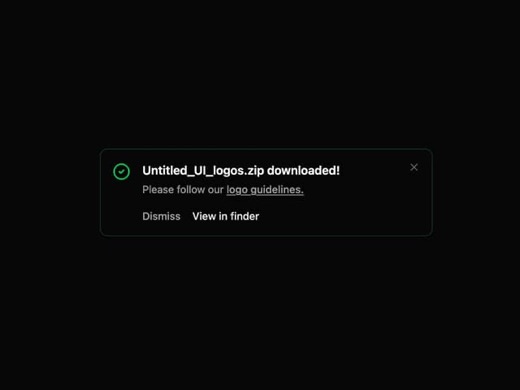
A reusable alert banner component with multiple variants (success, destructive, warning, default) featuring built-in status icons, dismiss functionality, and optional primary/secondary action buttons. Built with Tailwind
class-variance-authority framer-motion lucide-react
A versatile alert and notification component with multiple variants (primary, secondary, destructive, success, info, warning, mono) and appearances (solid, outline, light, stroke). Features customizable sizes, icon slots
@radix-ui/react-slot class-variance-authority lucide-react next-themes radix-ui sonner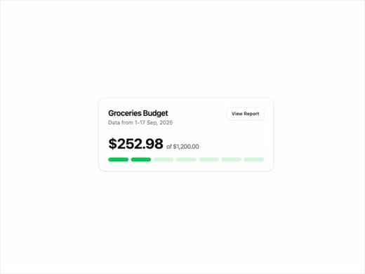
A SpendingLimitCard component from lavikatiyar's card collection that displays financial spending information with a clean, minimalist card design. Features subtle shadows, rounded corners, and interactive button element
@radix-ui/react-slot class-variance-authority framer-motion lucide-react
A collection of five animated theme toggle button variants featuring smooth motion transitions using Framer Motion. Each variant offers unique visual styling for light/dark mode switching, with support for layout animati
framer-motion lucide-react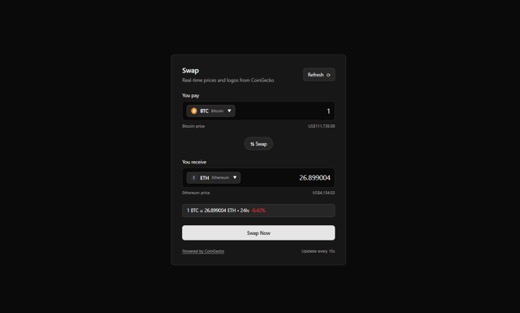
A cryptocurrency swap card component featuring real-time price fetching from CoinGecko API with auto-refresh capabilities. Users can select source and destination cryptocurrencies, input swap amounts, and view live excha
framer-motion swr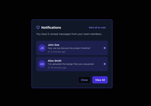
A Radix UI-based alert dialog system with smooth fade, zoom, and slide animations. Features a semi-transparent overlay backdrop, accessible keyboard navigation, and a responsive centered modal with configurable header, b
@radix-ui/react-alert-dialog @radix-ui/react-slot class-variance-authority lucide-react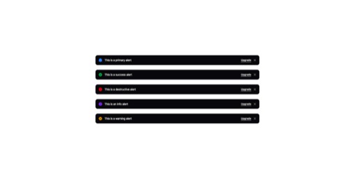
A versatile button component featuring 11 variant styles including a distinctive monochrome option with dark/light mode support. Supports multiple button appearances (default, ghost, underlined) and sizes, with built-in
@radix-ui/react-slot class-variance-authority lucide-react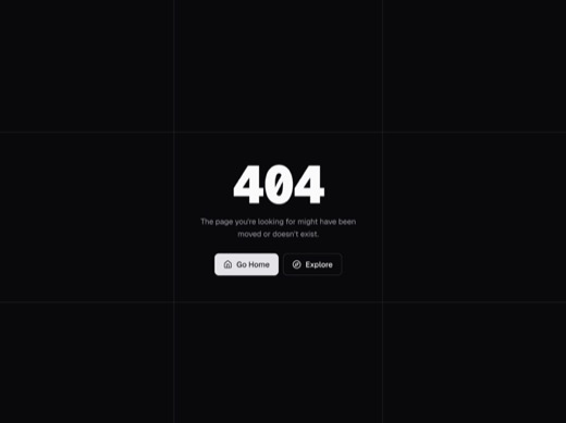
A minimalist 404 error page component designed to display when requested content cannot be found. Features a clean, modern aesthetic suitable for any industry, with an embedded Avatar component using Radix UI primitives
@radix-ui/react-avatar @radix-ui/react-slot class-variance-authority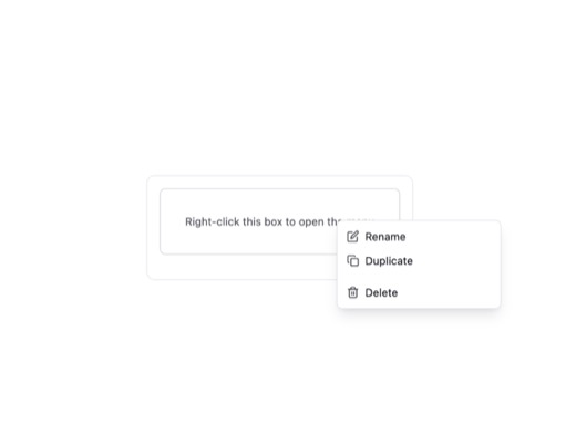
A context menu component with hover states, active states, and keyboard navigation support. Features a Row subcomponent with icon slot, children text, and right slot for additional actions. Includes dark mode support via
@subframe/core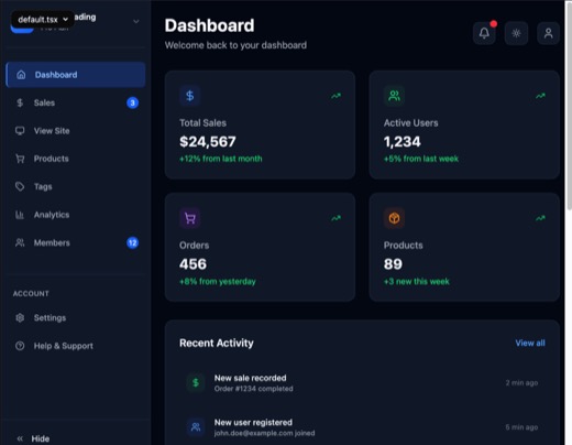
A collapsible sidebar navigation component for dashboard interfaces featuring smooth expand/collapse transitions, dark/light mode toggle, notification badges, and active state highlighting. Built with Tailwind CSS and Lu
lucide-react